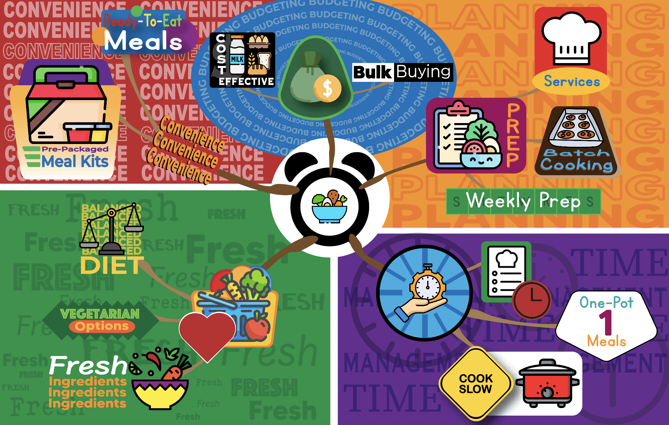
Eastside Park Community Center
Eastside Park Community Center
Eastside Park Community Center
A Daycare located in East Greensboro
A Daycare located in East Greensboro
A Daycare located in East Greensboro
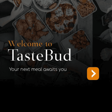
A Party Drone App that makes you the DJ
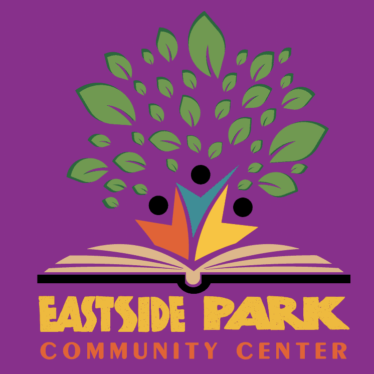
My approach was centered around a tree, symbolizing growth and the kids themselves, pictured as the trunk. There is a book seen under the kids emphasizing their focus on knowledge. The tree is actually a physical object the daycare uses as a time of reflection for the kids, calling it the "Tree of Knowledge," where the kids circle around a small tree outside of the center and discuss something they want to speak on.
My approach was centered around a tree, symbolizing growth and the kids themselves, pictured as the trunk. There is a book seen under the kids emphasizing their focus on knowledge. The tree is actually a physical object the daycare uses as a time of reflection for the kids, calling it the "Tree of Knowledge," where the kids circle around a small tree outside of the center and discuss something they want to speak on.
My approach was centered around a tree, symbolizing growth and the kids themselves, pictured as the trunk. There is a book seen under the kids emphasizing their focus on knowledge. The tree is actually a physical object the daycare uses as a time of reflection for the kids, calling it the "Tree of Knowledge," where the kids circle around a small tree outside of the center and discuss something they want to speak on.
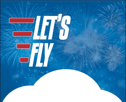
Utilizing negative space in order to create contrast in lettering, this logo contains two letters, the letter "L" can be seen first in a bold blue, symbolizing the "Let's" in the app name Let's Fly. Opposite this is a figure resembling a backwards "L" with an extra stem. This space between the two symbols creates the letter "F," for "Fly" in the app name. This negative space separates the two letters, and the logo itself from any other.
My approach was centered around a tree, symbolizing growth and the kids themselves, pictured as the trunk. There is a book seen under the kids emphasizing their focus on knowledge. The tree is actually a physical object the daycare uses as a time of reflection for the kids, calling it the "Tree of Knowledge," where the kids circle around a small tree outside of the center and discuss something they want to speak on.
My approach was centered around a tree, symbolizing growth and the kids themselves, pictured as the trunk. There is a book seen under the kids emphasizing their focus on knowledge. The tree is actually a physical object the daycare uses as a time of reflection for the kids, calling it the "Tree of Knowledge," where the kids circle around a small tree outside of the center and discuss something they want to speak on.
Eastside Park Community Center
Eastside Park Community Center
A Daycare located in East Greensboro
A Daycare located in East Greensboro
A Party Drone App that makes you the DJ
Utilizing negative space in order to create contrast in lettering, this logo contains two letters, the letter "L" can be seen first in a bold blue, symbolizing the "Let's" in the app name Let's Fly. Opposite this is a figure resembling a backwards "L" with an extra stem. This space between the two symbols creates the letter "F," for "Fly" in the app name. This negative space separates the two letters, and the logo itself from any other.
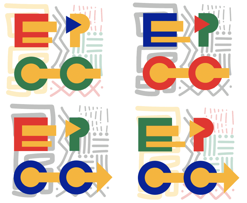
This took a more modern and abstract approach. I identified the use of form in lettering and typography and simplified it by layering the three basic shapes in order to create lettering. Also implementing an elementary color scheme of red, yellow, blue, and green, this simple you effective logo creates a family-friendly feeling, with a modern and minimalistic look.
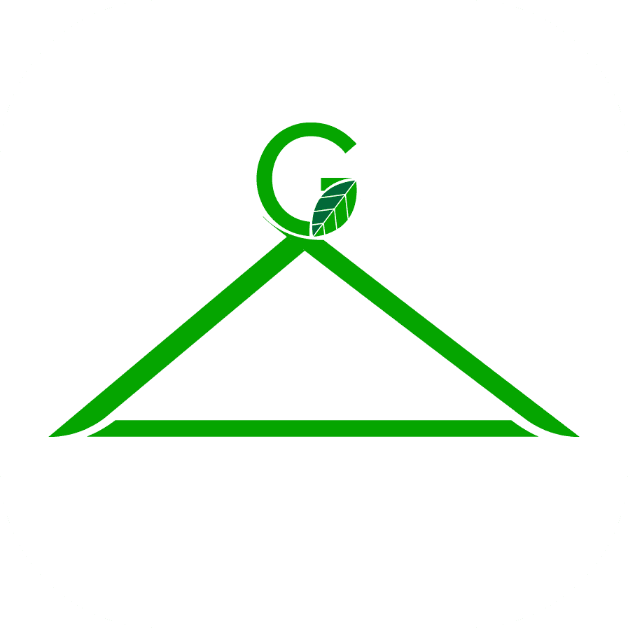
Taking inspiration from one color, and matching themes surrounding it, this logo displays a modern look for an eco-friendly sustainable clothing company. I've put emphasis on the the hangar, increasing the users ability to realize the nature of this company. On top of the hanger sits a "G," representing the indetifying theme of the company. Inside the "G" I've used an iconic green symbol; the leaf, and attached the "G" to the hanger bottom to tie the theme back together.
This took a more modern and abstract approach. I identified the use of form in lettering and typography, simplifying it by layering the three basic shapes in order to create lettering. Also implementing an elementary color scheme of red, yellow, blue, and green, this simple you effective logo creates a family-friendly feeling, with a modern and minimalistic look.
Taking inspiration from one color, and matching themes surrounding it, this logo displays a modern look for an eco-friendly sustainable clothing company. I've put emphasis on the the hangar, increasing the users ability to realize the nature of this company. On top of the hanger sits a "G," representing the indetifying theme of the company. Inside the "G" I've used an iconic green symbol; the leaf, and attached the "G" to the hanger bottom to tie the theme back together.